kage
kage
storyshort.ai
Design analysis
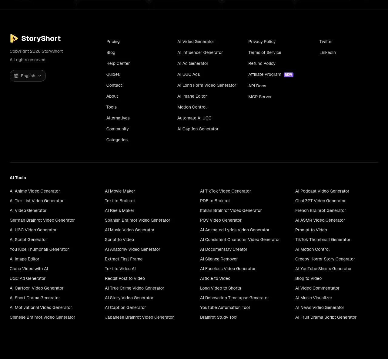
The footer combines brand/copyright information, several link columns, a language selector, and a dense secondary directory of related tools separated by a fine divider.
Prompt preview
## Reference images

Study these alongside the description below: hierarchy, rhythm, spacing, colour. Build for the product you are asked about, using this design language.

- Component: https://kage-design-assets.t3.tigrisfiles.io/components/storyshort-ai/c734da75-ded5-4c81-9b78-0aa9ae185a47-1791551955-10.webp
- Full page it was cut from: https://kage-design-assets.t3.tigrisfiles.io/screenshots/storyshort-ai/c734da75-ded5-4c81-9b78-0aa9ae185a47-1791551915904-full.webp
- Component on Kage: https://kage.design/component/storyshort-footer

## Before you start
Ask what links, legal pages, resource categories, tools, and localization options the user's product actually needs. Keep only useful destinations and adapt the density to the product's maturity.

Build a full-width black footer with a top border and a constrained content container. The first row should place brand and copyright details at left, then 3–4 columns of small navigation links. Use 12–13px type, generous row spacing, muted gray defaults (#9a9a9a), white hover states, and subtle accent badges only for genuinely important items. Include a compact language selector if localization is relevant. Add a thin divider, then a secondary directory grid of related tools or resources in 4 columns. Use 56–72px top padding, 32px bottom padding, and a responsive collapse to stacked groups on mobile.

Never: use the reference's logo, product name, copy, illustrations, imagery, or exact link lists.