 kage
kage
supabase.com

Design analysis
A restrained feature showcase that pairs a clear two-line heading with pill-shaped tabs and a large framed product preview. The monochrome treatment, generous whitespace, and subtle active-state contrast keep attention on the selected workflow while making the component easy to adapt to another product.
Prompt preview
## Reference images

Study these alongside the description below: hierarchy, rhythm, spacing, colour. Build for the product you are asked about, using this design language.

- Component: https://kage-design-assets.t3.tigrisfiles.io/components/supabase-com/b03f69f9-4b47-487d-8f2b-17d7cd19e877-1789060352-3.webp
- Full page it was cut from: https://kage-design-assets.t3.tigrisfiles.io/screenshots/supabase-com/b03f69f9-4b47-487d-8f2b-17d7cd19e877-1789060301-full.webp
- Component on Kage: https://kage.design/component/supabase-tabs

## Before you start
Ask what the user's product is, who it is for, and what brand direction, colours, typography, and feature names should be used. Then apply the principles below to that product rather than reproducing the reference literally.

## Build a responsive feature-tabs section
Create a polished marketing-page section that explains several related product capabilities through interactive tabs. The section should feel calm, editorial, and product-led: a concise headline sits above a compact tab control, followed by a large visual preview of the selected capability.

### Layout and alignment
- Use a centered content container with a generous maximum width, approximately 1080–1200px, and responsive horizontal padding of 24–48px.
- Align the heading and tab row to the same left edge; do not center each item independently.
- Place a two-line heading at the top with a comfortable gap before the tabs, then a larger gap before the preview panel.
- Use a horizontal tab row on desktop with compact pill buttons. On narrow screens, allow horizontal scrolling or wrap the tabs without creating cramped controls.
- Make the selected tab update the preview content. Keep the preview area’s height stable enough to avoid jarring layout shifts.
- Render the preview as a wide, lightweight product mockup or interface illustration inside a bordered window. It should occupy most of the available width and remain legible without becoming visually dense.
- Below this component, leave substantial vertical breathing room before the next section. If adding a second related content block, separate it clearly rather than merging it into the tab panel.

### Typography hierarchy
- Use a modern sans-serif with a confident but neutral tone.
- Set the heading large and tight, around 34–48px on desktop and 28–36px on mobile, with line-height around 1.05–1.15 and medium-to-semibold weight.
- Make the first line visually stronger and the supporting line slightly quieter through colour rather than a radically different size.
- Use 14–16px tab labels with medium weight and a readable line-height.
- Keep any mockup labels, metadata, or helper text small and subdued so the section hierarchy remains clear.

### Colour
- Use a warm or neutral near-white page background, approximately `#FFFFFF` to `#FAFAF9`.
- Use near-black for the primary heading, approximately `#111111` or `#171717`.
- Use a cool or warm mid-grey for the secondary heading line and inactive tab labels, approximately `#737373` to `#858585`.
- Use a very pale grey for inactive tab fills or preview surfaces, approximately `#F7F7F7`.
- Use a dark neutral border for the active tab, approximately `#171717`, with a very light grey border such as `#E5E5E5` for inactive controls and the preview frame.
- If the product has an accent colour, reserve it for meaningful product states inside the preview rather than decorating every tab.

### Borders, radius, and depth
- Make tabs fully rounded, with a 999px radius, approximately 38–40px tall, and horizontal padding around 24–32px.
- Give the preview window a restrained 12–16px corner radius and a 1px border.
- Avoid heavy shadows. If depth is needed, use an extremely soft shadow such as `0 8px 30px rgba(0,0,0,0.04)`.
- Keep interface mockup borders, dividers, fields, and panels subtle and consistent.

### Interaction and accessibility
- Use real buttons with an accessible tab pattern: `role="tablist"`, `role="tab"`, and associated tab panels, or an equivalent accessible implementation.
- The active tab should have a clear dark outline/border and stronger text; inactive tabs should remain low contrast but readable.
- Add a short, restrained transition when switching panels, such as a fade or slight translate, without delaying access to content.
- Provide visible keyboard focus styles that are distinct from the active state.
- Support arrow-key navigation where appropriate, preserve a logical tab order, and ensure the component works without hover.
- On mobile, keep touch targets at least 44px high and prevent tab labels from being clipped.

### Content guidance
- Use the user’s actual feature names and product language. Each panel should show a distinct workflow or benefit, not just a colour change.
- Prefer a simple, believable preview made from generic UI primitives: navigation rows, fields, cards, tables, code-like text, or status indicators.
- Keep preview content sparse and slightly abstract so the section communicates the product category without becoming a full application screen.

## Never
- Never copy the reference’s logos, product names, feature names, exact copy, code, or interface content.
- Never use the reference’s illustrations, screenshots, imagery, or recognizable brand marks.
- Never reproduce the exact spacing, dimensions, typography, or visual treatment as a pixel-for-pixel clone.
- Never make inactive tabs inaccessible, overly faint, or dependent on colour alone to communicate state.
- Never add decorative elements that compete with the selected product preview.
More components

 Directory filters and sorting
The Brains · Tabs & steps
Directory filters and sorting
The Brains · Tabs & steps

 Enterprise use cases
bestproxy.com · Tabs & steps
Enterprise use cases
bestproxy.com · Tabs & steps
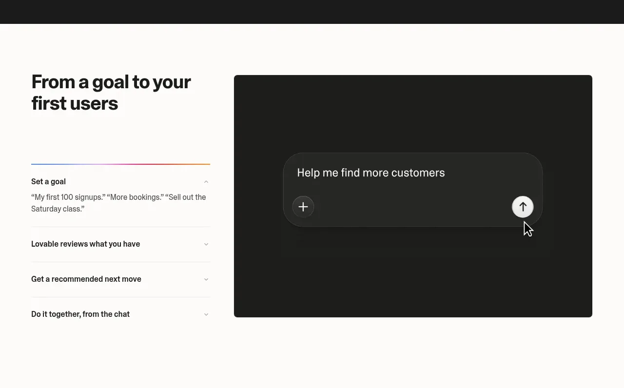
 Goal-to-first-users assistant
Lovable Growth Tools · Tabs & steps
Goal-to-first-users assistant
Lovable Growth Tools · Tabs & steps
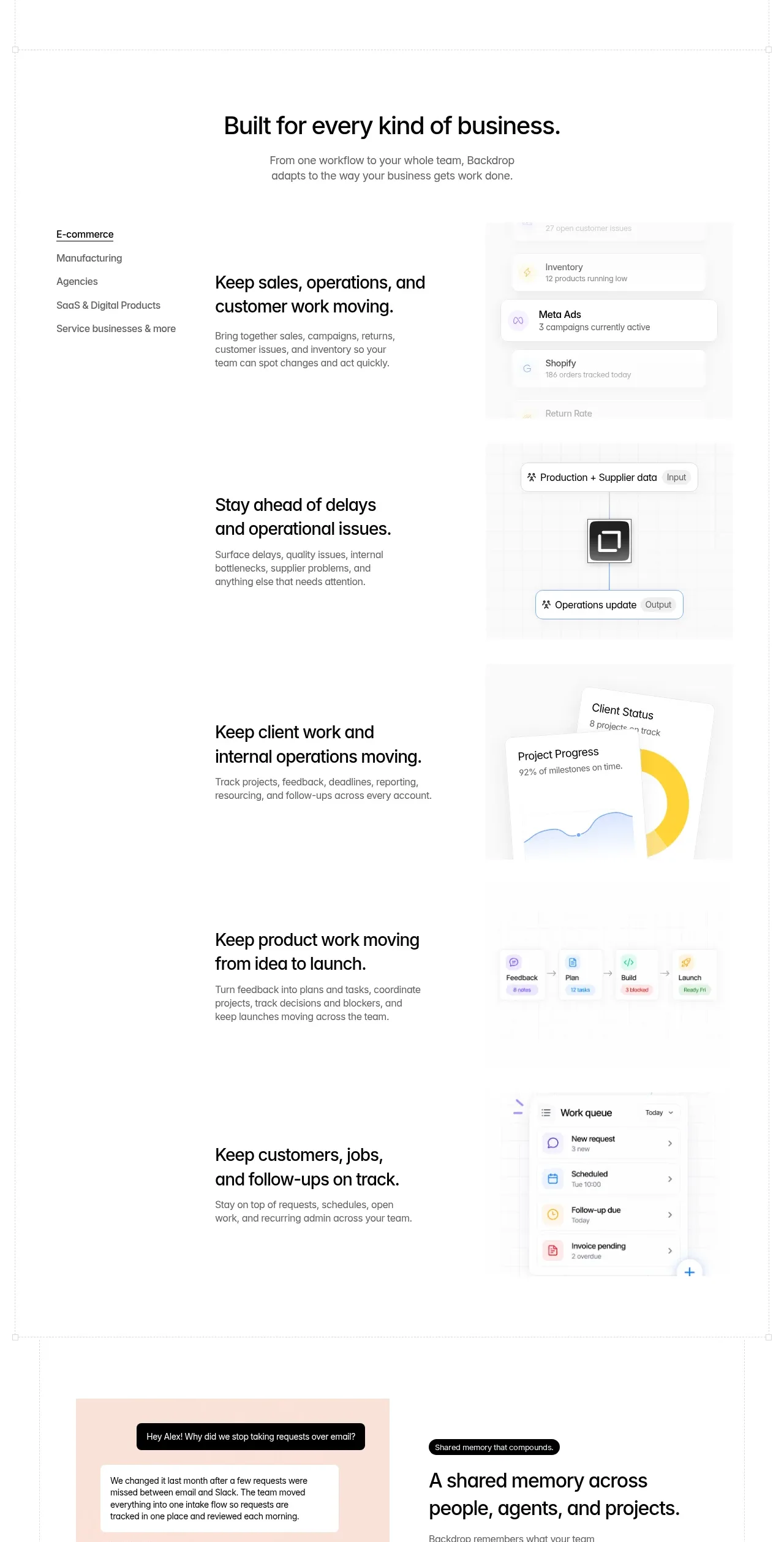
 Business use cases tabs
Backdrop · Tabs & steps
Business use cases tabs
Backdrop · Tabs & steps
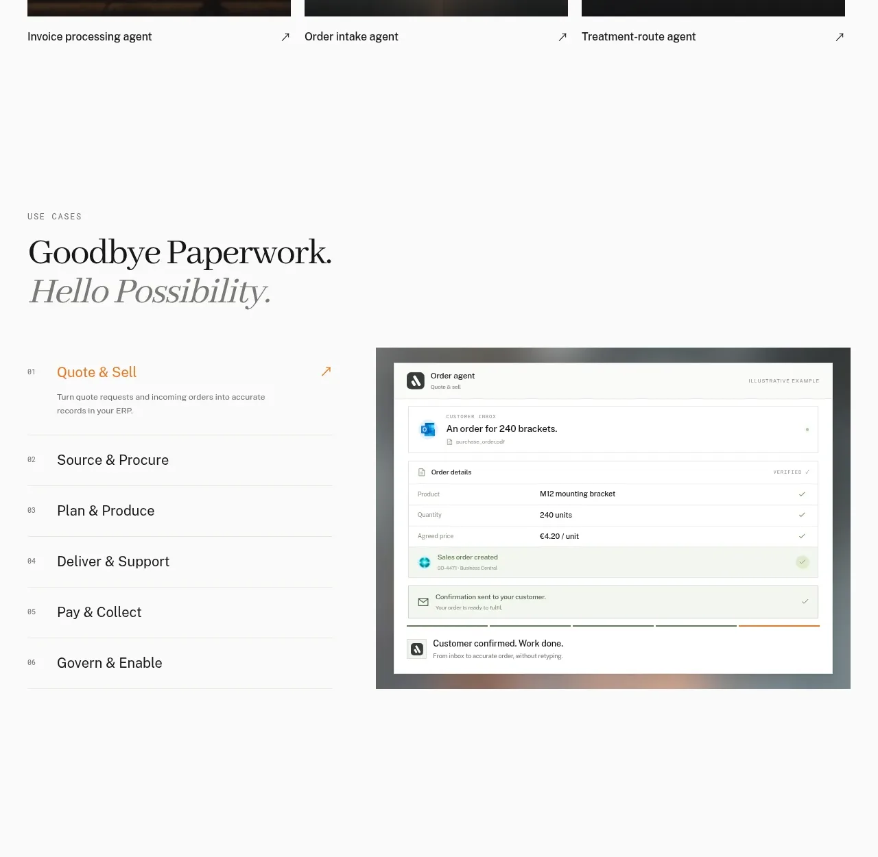
 Workflow stages with product preview
Lleverage · Tabs & steps
Workflow stages with product preview
Lleverage · Tabs & steps
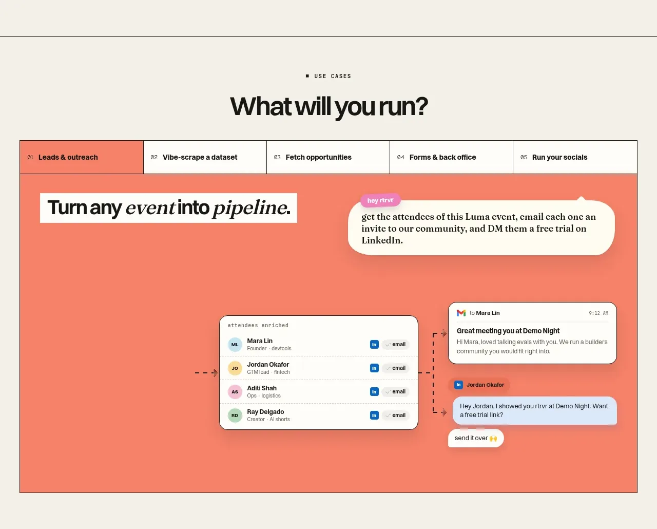
 Use-case selector and interactive showcase
Retriever AI · Tabs & steps
Use-case selector and interactive showcase
Retriever AI · Tabs & steps