 kage
kage
supabase.com

Design analysis
A spacious, white developer-platform landing page uses a restrained black-and-gray type system with Supabase green reserved for actions and emphasis. The page moves from a compact announcement and navigation into a two-column hero, then a dense six-card capability grid, proof logos, product UI demonstrations, code and templates, customer stories, community posts, open-source messaging, a repeated CTA, and a highly structured footer. Thin borders, very soft shadows, modest corner radii, grayscale product imagery, and a single vivid gradient story card create contrast without changing the overall minimal rhythm.
Prompt preview
## Reference images

Study these alongside the description below: hierarchy, rhythm, spacing, colour. Build for the product you are asked about, using this design language.

- Full page: https://kage-design-assets.t3.tigrisfiles.io/screenshots/supabase-com/b03f69f9-4b47-487d-8f2b-17d7cd19e877-1789060301-full.webp
- Above the fold: https://kage-design-assets.t3.tigrisfiles.io/screenshots/supabase-com/b03f69f9-4b47-487d-8f2b-17d7cd19e877-1789059993054.webp
- Design on Kage: https://kage.design/designs/supabase-landing-page

## Before you start
Ask the user what they are building, who it is for, and what brand assets they already have, including the product name, colours, typography, logo, and any imagery or UI screenshots. Wait for their answers before designing. Apply the system below to their product rather than copying the reference.

## Page structure
1. **Announcement strip:** Add a very shallow, full-width notice above the navigation, with centered event or product news, a subtle pale technical texture at the edges, and one underlined green action.
2. **Primary navigation:** Use a white horizontal header with the brand at left, grouped dropdown links in the middle, and compact GitHub/social proof, sign-in, and green primary CTA controls at right.
3. **Hero:** Present a generous two-column introduction inside a constrained centered container. Put a large two-line headline on the left with the second line in green, CTA buttons beneath it, and a concise product capability paragraph on the right.
4. **Capability grid:** Follow with a six-card product overview: one large database card spanning two columns and smaller Authentication and Edge Functions cards beside it, then Storage, Realtime, Vector, and Data APIs beneath. Each card has a small icon, short title, concise description, and faint monochrome technical illustration or UI fragment.
5. **Platform positioning line:** Place a short statement immediately below the grid, combining a darker lead phrase with lighter supporting text.
6. **Trusted-by logo band:** Add a lightly bordered horizontal band with a small trust label and two rows of muted grayscale customer logos. Keep it quiet and low-contrast.
7. **Dashboard productivity section:** Introduce a large heading about managing the app without leaving the dashboard, with a darker first line and gray second line. Add pill-like tabs, then a wide framed dashboard screenshot with very soft contrast and a thin border.
8. **Framework code section:** Use a spacious two-column row. Put a large typographic heading on the left and a bordered code panel on the right with framework tabs, syntax-colored code, and a small documentation link in the lower corner.
9. **Templates section:** Add a section heading and a right-aligned examples link. Show two prominent wide template cards on the first row, followed by four smaller cards below; each card uses a bordered white surface, compact metadata, description, and a pale product preview.
10. **Customer stories section:** Introduce industry proof with a heading and a right-side stories link. Build a featured story panel using a vivid pink-to-orange gradient, white text, quote, author detail, and story link, alongside several narrow dark or saturated vertical story selectors.
11. **Community section:** Center a heading, explanatory sentence, and outlined join button. Below, create a horizontally distributed wall of small bordered testimonial cards, with staggered columns and clipped/faded cards at the outer edges to imply a larger feed.
12. **Open-source section:** Use a shallow two-column band with a heading, concise paragraph, and GitHub button on the left; place a pale green pixel/digital open-source visual on the right.
13. **Closing CTA:** Center a repeated headline with one muted phrase and one dark phrase, followed by paired green primary and outlined secondary buttons.
14. **Security reassurance row:** Add a compact centered strip beneath the CTA stating data protection and listing several compliance certifications separated by checkmarks.
15. **Footer:** Build a large multi-column footer. Put the brand, social icons, newsletter description, email field, and subscribe button in the first column; follow with dense link columns for Product, Solutions, Resources, Developers, Community, and Company.
16. **Footer baseline:** Finish with a thin divider, small copyright text at left, and a minimal theme or display control at right.

## Design language
- Build hierarchy with large black headlines, restrained gray supporting copy, and generous whitespace; use one emphasized phrase per headline rather than many competing colours.
- Start with spacious hero composition, increase information density in the capability grid and template cards, then loosen the rhythm for code, stories, and community before ending in a dense navigation footer.
- Use a mostly white canvas around `#ffffff`, near-black text around `#111111`, secondary gray around `#6b7280`, and very pale borders around `#e5e7eb`.
- Reserve a mint green accent around `#3ecf8e` for primary buttons, highlighted headline text, small links, and selected states. Let one proof/story module use a separate saturated pink-to-orange gradient around `#f72585` to `#ff9f1c` as a deliberate focal contrast.
- Pair a clean modern sans-serif for all interface and marketing text with a monospace face for code, technical labels, or subtle developer-oriented details. Use an approximate scale of 48–64px for the hero, 30–40px for section headings, 16–20px for card titles, and 12–14px for metadata and footer links.
- Keep surfaces white with 1px light-gray borders, small-to-medium radii around 6–10px, and barely perceptible shadows. Avoid heavy elevation; depth should come from framing, spacing, and contrast.
- Use grayscale line drawings, blurred UI previews, pixel textures, and technical diagrams as supporting visuals rather than decorative illustrations. Keep them low opacity so text remains primary.
- Make buttons compact and rectangular with modest radius, clear border treatment, and strong text contrast. Use pill shapes only for dashboard tabs or segmented controls.
- Treat product previews as framed browser or application panels with fine dividers and restrained blur; use tabs and selected states to make them feel interactive.
- Use subtle hover transitions on buttons, cards, links, and tabs: slight colour shift, border darkening, or a small translate effect. Avoid loud animation; if sections reveal on scroll, use short opacity and vertical easing.
- Preserve a centered max-width container, consistent horizontal alignment, thin section rules, and generous vertical padding so the page feels like one coherent documentation-adjacent product system.

## Never
- Do not use Supabase logos, wordmarks, product names, slogans, exact copy, customer logos, testimonials, screenshots, illustrations, icon sets, or distinctive branded artwork from the reference.
- Do not present the result as Supabase or imply affiliation with it.
- Replace all reference content with the user's own product, audience, brand assets, examples, and interface imagery.
Components from this page
All components
 Announcement banner with primary navigation
supabase.com · Navigation
Announcement banner with primary navigation
supabase.com · Navigation
 Platform capability mosaic hero
supabase.com · Hero
Platform capability mosaic hero
supabase.com · Hero
 Trusted-by logo cloud
supabase.com · Logo cloud
Trusted-by logo cloud
supabase.com · Logo cloud
 Product feature tabs
supabase.com · Tabs & steps
Product feature tabs
supabase.com · Tabs & steps
 Template showcase grid
supabase.com · Code block
Template showcase grid
supabase.com · Code block
 Expandable customer story gallery
supabase.com · Gallery
Expandable customer story gallery
supabase.com · Gallery
 Community testimonial stream
supabase.com · Testimonials
Community testimonial stream
supabase.com · Testimonials
 Fading masonry testimonials
supabase.com · Testimonials
Fading masonry testimonials
supabase.com · Testimonials
 Centered trust-building CTA
supabase.com · Call to action
Centered trust-building CTA
supabase.com · Call to action
 Newsletter signup footer
supabase.com · Call to action
Newsletter signup footer
supabase.com · Call to action
 Minimal multi-column link directory
supabase.com · Banner
Minimal multi-column link directory
supabase.com · Banner
 Minimal editorial footer
supabase.com · Footer
Minimal editorial footer
supabase.com · Footer
Related designs
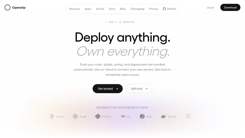

 OpenShip Cloud
Landing page · Cloud & infrastructure
OpenShip Cloud
Landing page · Cloud & infrastructure
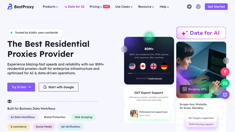

 bestproxy.com
Landing page · Cloud & infrastructure
bestproxy.com
Landing page · Cloud & infrastructure
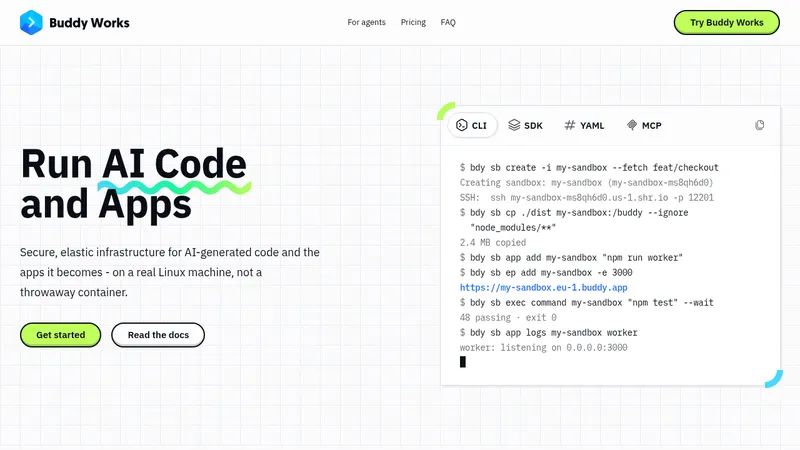

 AI Sandboxes by Buddy
Landing page · Cloud & infrastructure
AI Sandboxes by Buddy
Landing page · Cloud & infrastructure
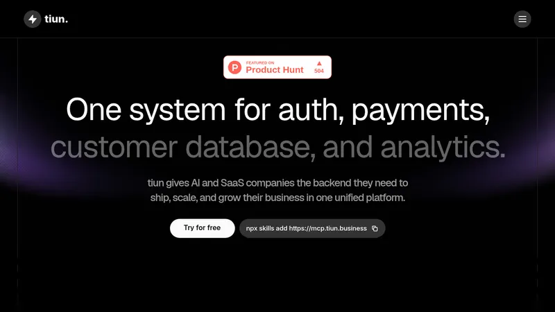

 tiun.
Landing page · Cloud & infrastructure
tiun.
Landing page · Cloud & infrastructure
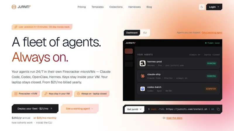

 jurniti
Landing page · Cloud & infrastructure
jurniti
Landing page · Cloud & infrastructure


 cloudflare.com
Landing page · Cloud & infrastructure
cloudflare.com
Landing page · Cloud & infrastructure