kage
brains.ceo
Design analysis
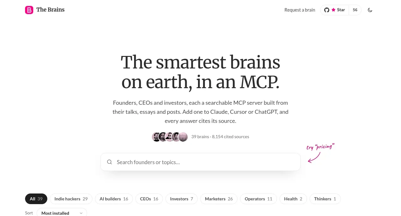
A centered serif headline, concise explanation, social proof, and prominent search field make the page purpose immediately clear and lead naturally into exploration.
Prompt preview
## Reference images

Study these alongside the description below: hierarchy, rhythm, spacing, colour. Build for the product you are asked about, using this design language.

- Component: https://kage-design-assets.t3.tigrisfiles.io/components/the-brains/a35aca56-f802-48ab-9290-e49eab0cde25-1792648933-1.webp
- Full page it was cut from: https://kage-design-assets.t3.tigrisfiles.io/screenshots/the-brains/a35aca56-f802-48ab-9290-e49eab0cde25-1792648871849-full.webp
- Component on Kage: https://kage.design/component/the-brains-hero

## Before you start
Ask the user what their product is, who it serves, and what brand personality and colours to use. Then apply the principles below to that product rather than reproducing the reference.

Create a spacious, centered hero for a searchable directory or knowledge product. Place a large two-line display headline in a high-contrast serif or distinctive display face, followed by a restrained sans-serif paragraph with a comfortable line length. Add a small credibility row with circular avatars or neutral indicators and a compact count, then finish with a wide search input as the primary interaction. Use white space generously, a near-black palette around #292526, muted grey copy around #686568, and a saturated pink accent around #e8327d for focus states and annotations. The search field should be white with a faint #e7e4e5 border, soft shadow, 10–12px radius, and a search icon; make it keyboard accessible and full width within a roughly 450–500px column. On mobile, reduce headline size while retaining the centered hierarchy.

Never: use logos, product names, copy, illustrations, or imagery from the reference.