kage
brains.ceo
Design analysis
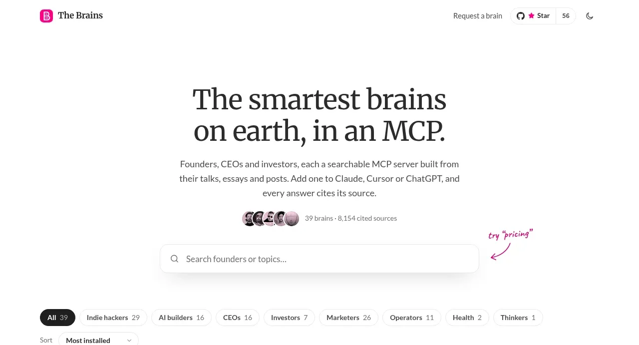
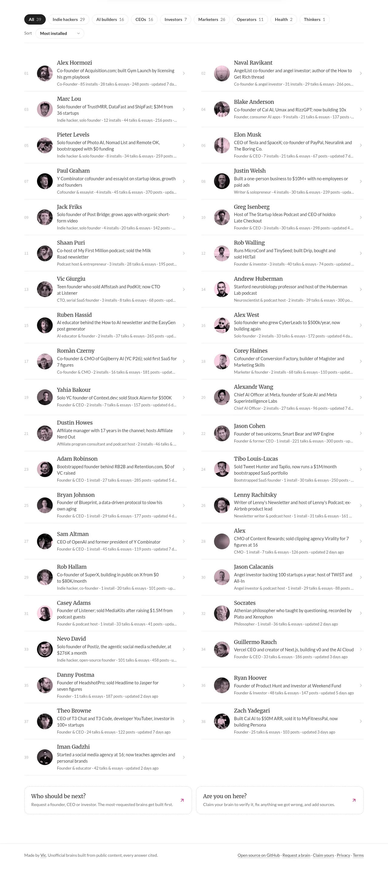
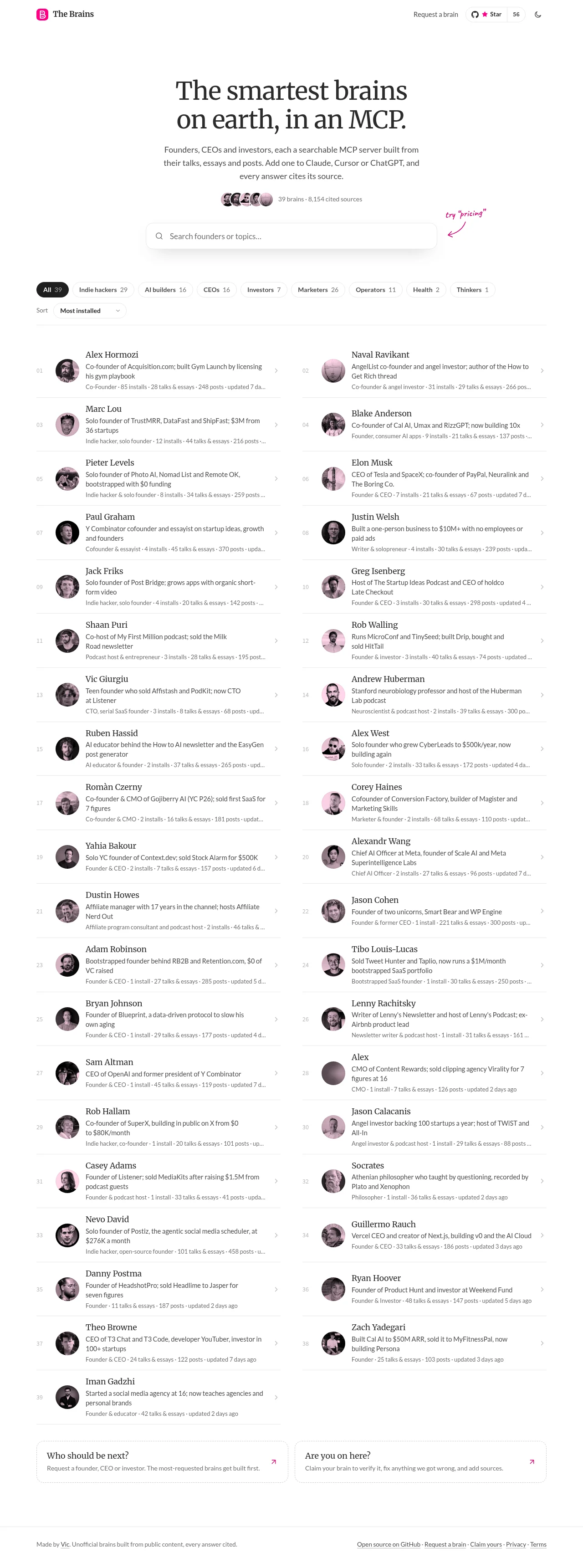
The design relies on extreme negative space and high contrast to create a sophisticated, editorial feel. Content is modular, using alternating two-column blocks where each block features a small profile element paired with dense, centered text. The typography is the primary structural element, with massive headlines paired against concise, well-spaced body copy.
Prompt preview
## Reference images

Study these alongside the description below: hierarchy, rhythm, spacing, colour. Build for the product you are asked about, using this design language.

- Full page: https://kage-design-assets.t3.tigrisfiles.io/screenshots/the-brains/a35aca56-f802-48ab-9290-e49eab0cde25-1792648871849-full.webp
- Above the fold: https://kage-design-assets.t3.tigrisfiles.io/screenshots/the-brains/a35aca56-f802-48ab-9290-e49eab0cde25-1792648868731.webp
- Design on Kage: https://kage.design/designs/the-brains-landing-page

## Before you start
Ask the user what they are building, who it is for, and what brand assets (name, colors, typography) they already have, and wait for the answers. All specifications below should be applied to the user's resulting product.

## Page structure
**Header:** A minimal top navigation bar, aligned right, containing only essential links (e.g., 'Pricing', 'Log In') and possibly a CTA.
**Hero Section:** A centered, high-impact opening. Features a massive, multi-line headline using a bold font weight, followed by a concise tagline beneath it. Plenty of vertical whitespace surrounds this section.
**Main Content Modules:** The main body consists of long, vertically scrolling content modules. These modules are primarily arranged in a two-column grid that alternates down the page. Each module follows a consistent internal pattern: a small, defined profile element (e.g., an avatar or icon) positioned on one side, followed by a block of structured text (title, summary, description) taking up the remaining space.
**Content Repetition:** This two-column, module-based structure repeats many times down the page, establishing a strong vertical rhythm for continuous scrolling.

## Design language
**Layout & Grid:** Use an extreme vertical rhythm and ample padding. The content is structured using a clean, grid-based approach, favoring symmetrical spacing and negative space over dense packing.
**Typography:** The design is dominated by typography. Use a high-contrast pairing: extremely large, confident headlines (perhaps a serif font) set against clear, highly readable, and moderate-sized body text (a clean sans-serif). All text blocks are treated with formal precision.
**Color Palette:** The palette is monochromatic with a single accent color. Background should be clean white (#FFFFFF). Primary text is black (#000000). Use a muted pink/mauve (#D9538D, or similar) sparingly for accent elements, links, or small design flourishes.
**Component Styling:** Profile elements are small, circular containers, treated minimally (no heavy borders or shadows). Content blocks are defined purely by whitespace and typographic hierarchy, not by heavy boxes or borders.
**Hierarchy:** Hierarchy is established through scale (massive headlines > section titles > body copy) and alignment (centered for the hero, left-aligned within columns for the modules).
**Density:** The overall page density is low to moderate. While the content is rich, the usage of whitespace ensures the page feels breathable and high-end.

## Never
Do not use any logos, wordmarks, product names, copy, specific illustrations, or photography from the reference. Do not present the final output as the reference product.