kage
kage
tinykpi.app
Design analysis
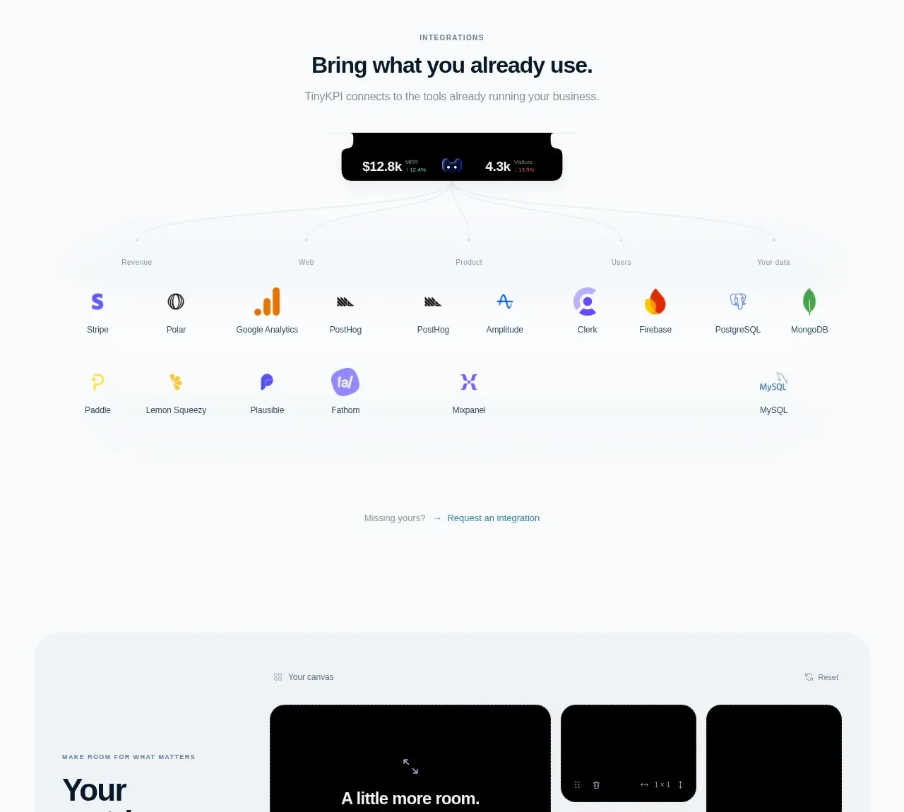
A centered integrations section explains compatibility, then visually maps a central product indicator to rows of categorized tools. The generous spacing and tiny labels keep a potentially dense logo list calm.
Prompt preview
## Reference images

Study these alongside the description below: hierarchy, rhythm, spacing, colour. Build for the product you are asked about, using this design language.

- Component: https://kage-design-assets.t3.tigrisfiles.io/components/tinykpi/a5c6b072-2fc8-4798-bcd8-9bd0bf616d58-1789711473-5.webp
- Full page it was cut from: https://kage-design-assets.t3.tigrisfiles.io/screenshots/tinykpi/a5c6b072-2fc8-4798-bcd8-9bd0bf616d58-1789711371888-full.webp
- Component on Kage: https://kage.design/component/tinykpi-logo-cloud

## Before you start
Ask what tools your user's product integrates with and how they should be categorized, then apply these principles to that product.

Create an integrations section with a centered eyebrow, heading, and one-sentence explanation. Add a small dark central status/product capsule, then show a light connector diagram branching into several category labels and a responsive grid of integration marks. Each item should include a simple neutral icon treatment and a tiny tool name; use two or three rows with consistent column widths. Use near-white #f8fafc, extremely faint connector lines #e3e9ed, dark capsule #070809, ink #13222d, and muted labels #7d8991. Include a low-emphasis text link below the grid for requesting an integration. Avoid making third-party marks visually louder than the product story; allow monochrome or softly tinted marks and graceful wrapping.

Never use logos, product names, copy, illustrations, or imagery from the reference.