kage
kage
tiun.io
Design analysis
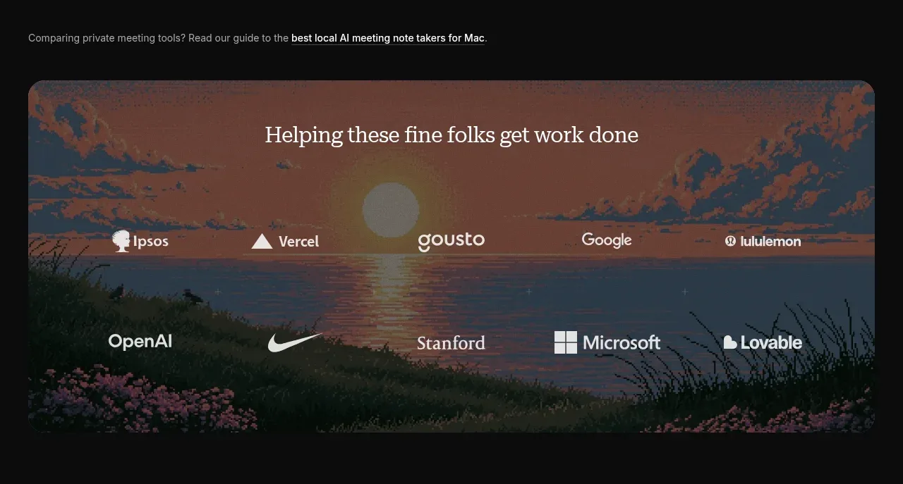
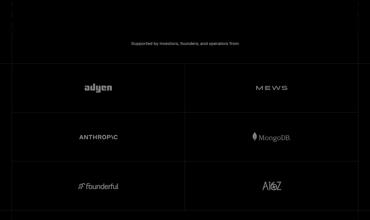
A short proof label introduces a six-cell, two-column grid of muted organization marks, making credibility visible without overpowering the page.
Prompt preview
## Reference images

Study these alongside the description below: hierarchy, rhythm, spacing, colour. Build for the product you are asked about, using this design language.

- Component: https://kage-design-assets.t3.tigrisfiles.io/components/tiun/82cad29c-5bdb-4fc9-91ef-0bee36475f7f-1789538798-2.webp
- Full page it was cut from: https://kage-design-assets.t3.tigrisfiles.io/screenshots/tiun/82cad29c-5bdb-4fc9-91ef-0bee36475f7f-1789538671428-full.webp
- Component on Kage: https://kage.design/component/tiun-logo-cloud

## Before you start
Ask which customers, partners, investors, or communities are safe and relevant to mention for the user's product. Adapt this proof pattern to their brand and permissions.

Build a dark logo-cloud section with a small centered or left-aligned eyebrow such as a credibility label, followed by a six-item grid. Use two columns on narrow layouts and more columns only when the marks remain legible. Give each cell equal height, 1px borders in #151515, and generous empty space. Render logos as monochrome gray (#777777–#A0A0A0), with no competing color. Use a black background and let the grid itself create rhythm. On hover, allow a modest brightness increase but no distracting animation.

Never: use the reference logo, product name, exact copy, illustrations, or imagery.