kage
kage
together.ai
Design analysis
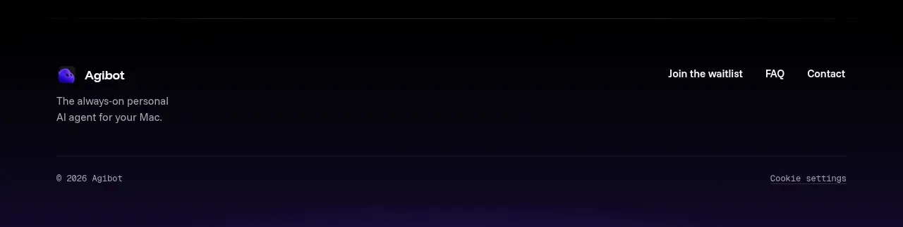
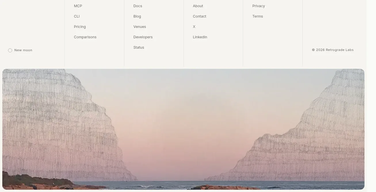
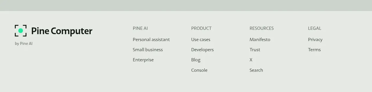
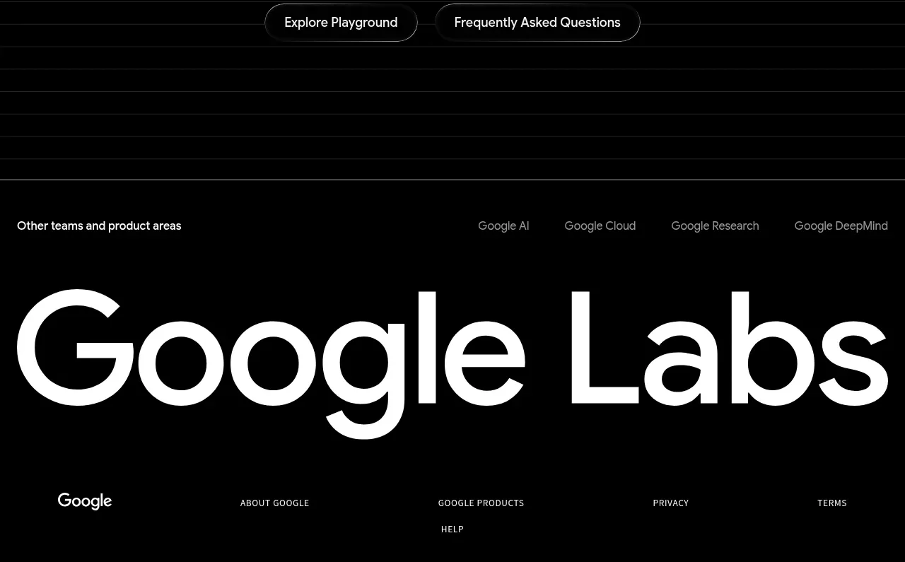
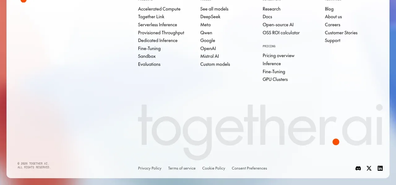
A large rounded white footer panel sits over a soft abstract gradient, organizing links into columns and ending with oversized muted brand lettering, legal links, and social icons.
Prompt preview
## Reference images

Study these alongside the description below: hierarchy, rhythm, spacing, colour. Build for the product you are asked about, using this design language.

- Component: https://kage-design-assets.t3.tigrisfiles.io/components/together-link/c83e90db-1751-48ac-9cb1-70c29bd77b17-1791612070-8.webp
- Full page it was cut from: https://kage-design-assets.t3.tigrisfiles.io/screenshots/together-link/c83e90db-1751-48ac-9cb1-70c29bd77b17-1791612038251-full.webp
- Component on Kage: https://kage.design/component/together-link-footer

## Before you start
Ask what link groups, legal destinations, social channels, and brand expression the user's product needs, then apply the following layout to that content.

Build a full-width footer over a soft, low-contrast abstract gradient background using cool blue, lavender, and coral tints. Place a large white panel with generous padding, 12px rounded corners, and a subtle border or shadow. Inside, organize links into four or five compact columns with tiny uppercase group labels and vertically spaced links. Below the columns, add an oversized low-contrast typographic brand treatment or abstract wordmark area, then a bottom row containing copyright, legal links, and small social icons. Use black `#111111`, muted gray `#737373`, white, and a very pale blue background. Ensure columns collapse into accordions or stacked groups on mobile, maintain accessible link contrast, and keep the footer visually calm despite its large height.

Never: use logos, product names, copy, illustrations, or imagery from the reference.