 kage
kage
nimbleway.com
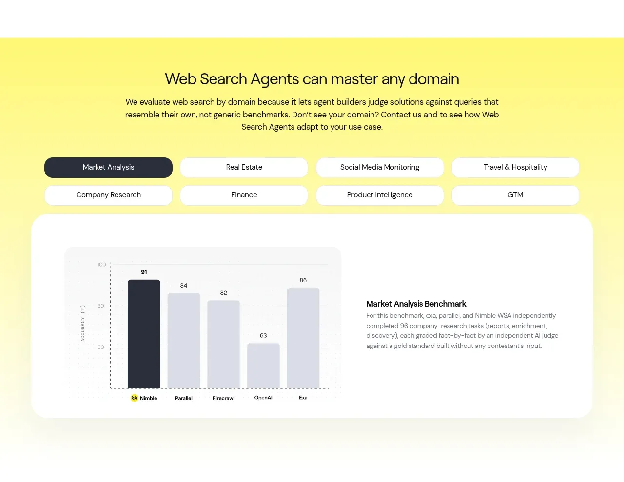
Design analysis
A vivid yellow section introduces domain-specific use cases, uses pill tabs, and anchors the content with a large rounded white benchmark card containing a chart and explanation.
Prompt preview
## Reference images

Study these alongside the description below: hierarchy, rhythm, spacing, colour. Build for the product you are asked about, using this design language.

- Component: https://kage-design-assets.t3.tigrisfiles.io/components/web-search-agents-by-nimble/b9f88c51-9261-49a4-af5a-25ccd481000c-1789452128-4.webp
- Full page it was cut from: https://kage-design-assets.t3.tigrisfiles.io/screenshots/web-search-agents-by-nimble/b9f88c51-9261-49a4-af5a-25ccd481000c-1789452077081-full.webp
- Component on Kage: https://kage.design/component/web-search-agents-by-nimble-chart

## Before you start
Ask what the user's product, audience, and brand identity are, then apply the principles below to that product rather than reproducing the reference.

Build a high-energy domain showcase section with a pale yellow-to-cream background around #FFF52A fading toward #FFFCE6. Center a clear section heading and a concise explanatory paragraph at the top, then place a two-row set of pill-shaped category tabs. The active tab should use deep charcoal #242632 with white text; inactive tabs should be white with a very light border and dark text. Below, create one large white rounded panel with about 28–36px radius and generous padding. Split it into a simple accessible bar chart on the left and a short benchmark explanation on the right. Use soft gray chart bars, one charcoal highlighted bar, small labels, and restrained grid lines. Maintain 32–48px gaps, strong alignment, and responsive stacking; tabs should become horizontally scrollable on mobile.

Never use the reference product name, exact heading, tab labels, benchmark numbers, chart copy, logos, or imagery.
More components
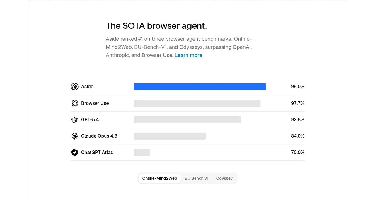
 Agent benchmark comparison
Aside · Chart
Agent benchmark comparison
Aside · Chart
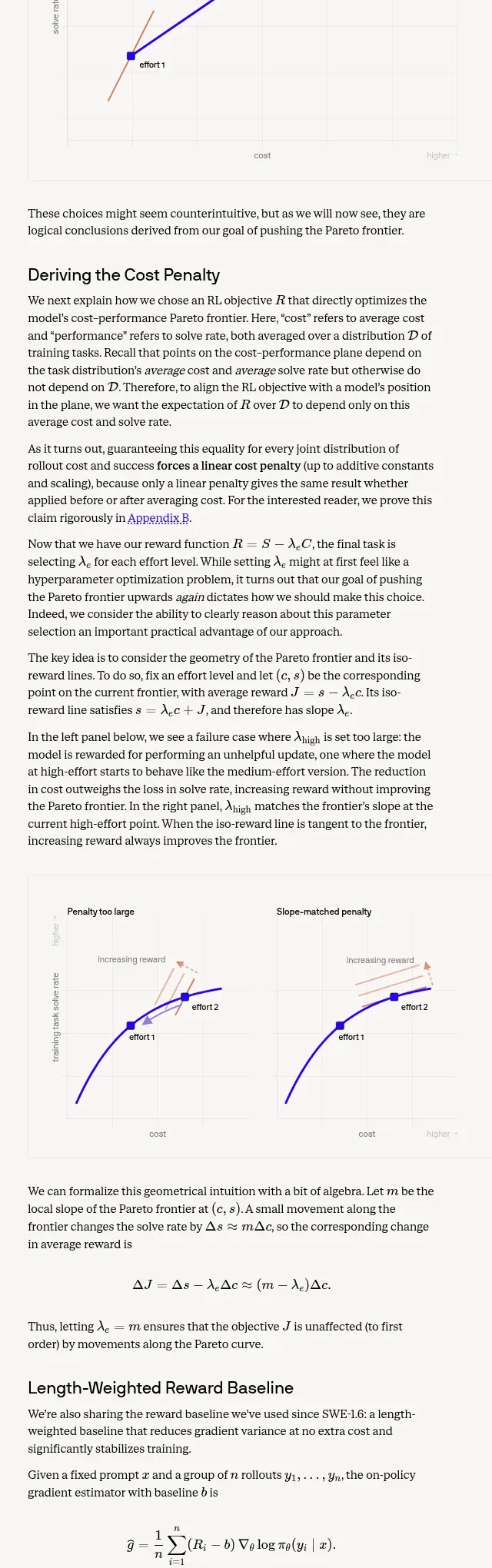
 Length-weighted reward and RL stability
Cognition's SWE-2 · Chart
Length-weighted reward and RL stability
Cognition's SWE-2 · Chart
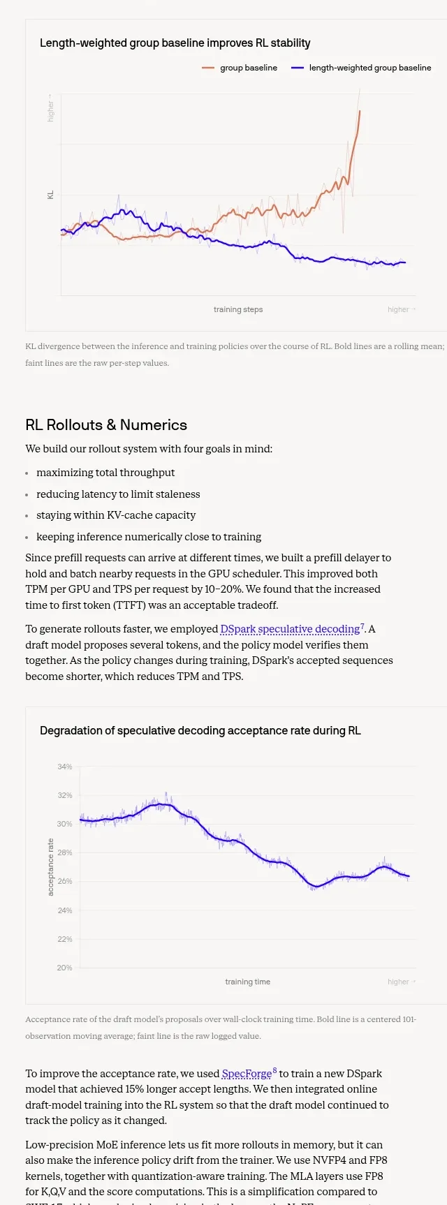 Trustworthiness evaluation charts
Cognition's SWE-2 · Chart
Trustworthiness evaluation charts
Cognition's SWE-2 · Chart
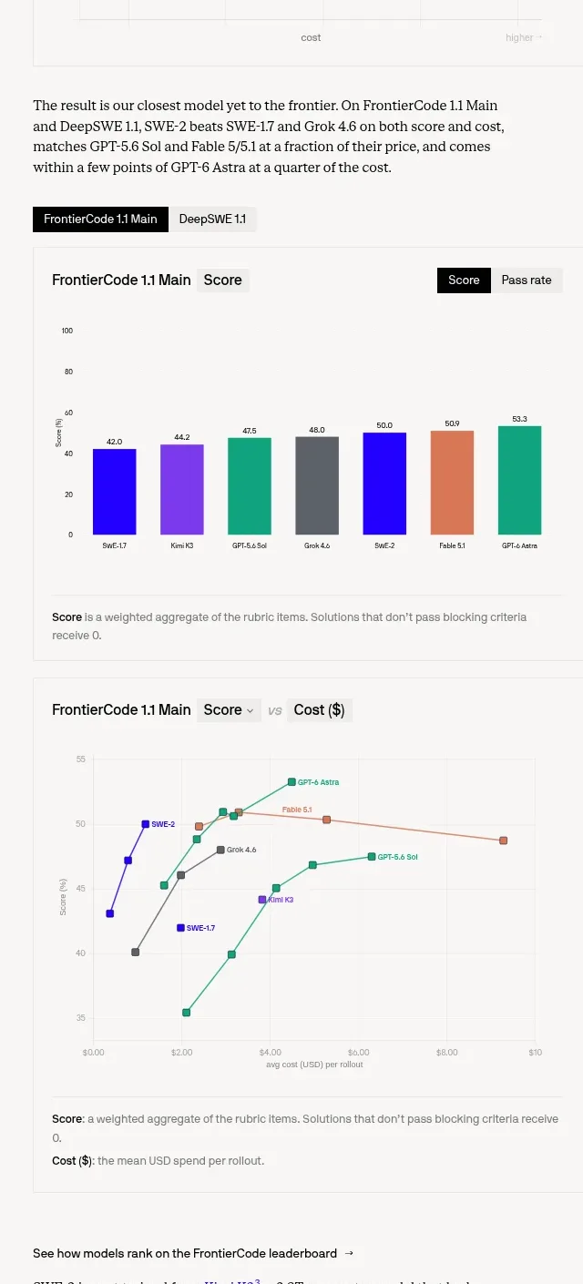 Benchmark score and cost charts
Cognition's SWE-2 · Chart
Benchmark score and cost charts
Cognition's SWE-2 · Chart

 Financial dashboard charts
tryobra.com · Chart
Financial dashboard charts
tryobra.com · Chart

 Old way vs live-product workflow comparison chart
Modeinspect · Chart
Old way vs live-product workflow comparison chart
Modeinspect · Chart