kage
kage
zellahq.com
Design analysis
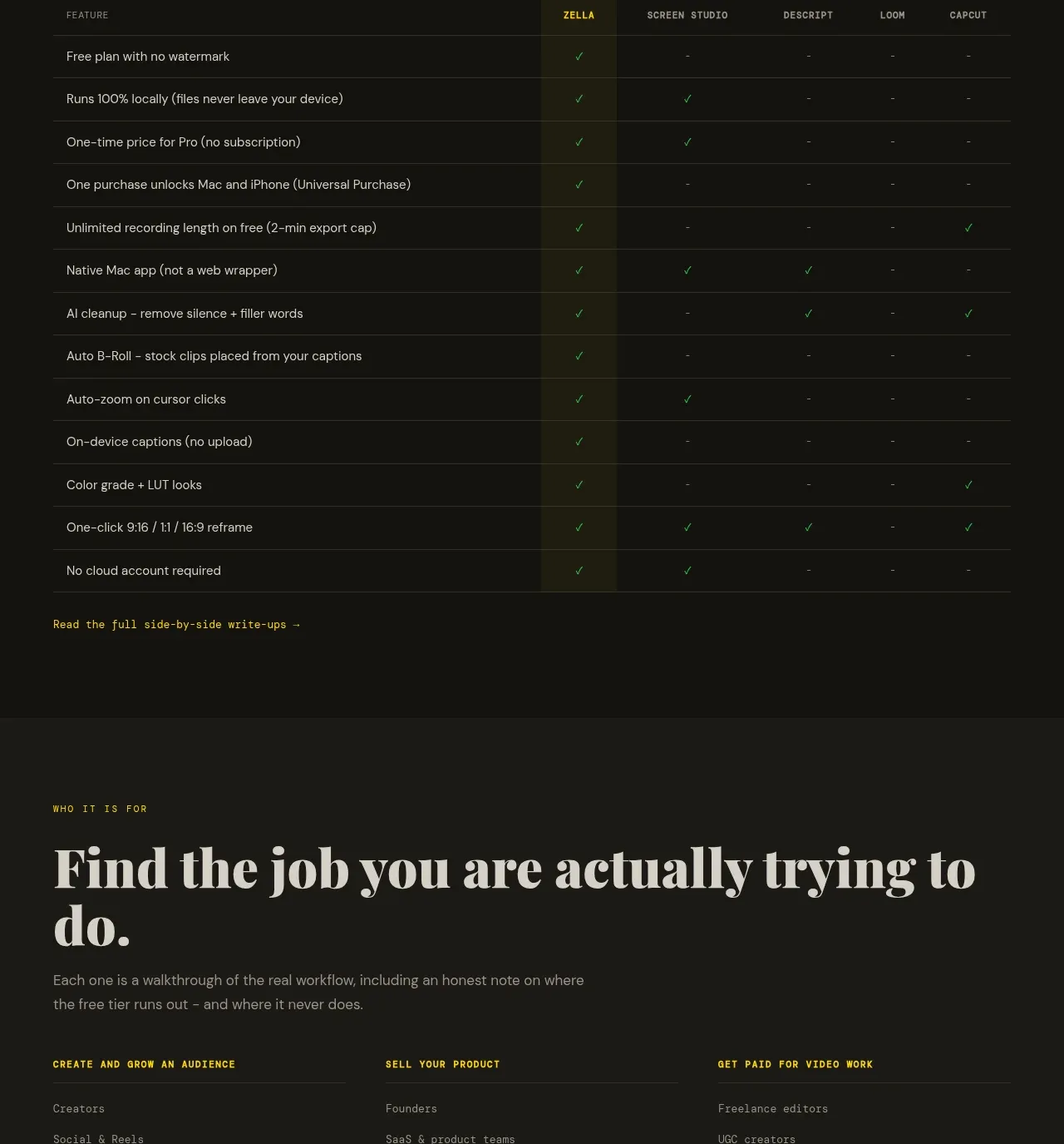
A factual comparison matrix lets visitors scan product capabilities across alternatives, with a highlighted first column and restrained checkmark treatment.
Prompt preview
## Reference images

Study these alongside the description below: hierarchy, rhythm, spacing, colour. Build for the product you are asked about, using this design language.

- Component: https://kage-design-assets.t3.tigrisfiles.io/components/zella/1ad8c25d-9254-4564-a81b-c4a3a0594691-1789711357-8.webp
- Full page it was cut from: https://kage-design-assets.t3.tigrisfiles.io/screenshots/zella/1ad8c25d-9254-4564-a81b-c4a3a0594691-1789711295290-full.webp
- Component on Kage: https://kage.design/component/zella-table

## Before you start
Ask what the user's product and brand are, then apply the principles below to that product rather than copying the reference.

Build a comparison section with a small eyebrow, large serif heading, and supporting sentence above a wide responsive table. Use the first column for capability names and several compact alternative columns. Keep header labels small and uppercase, align checkmarks and dashes centrally, and highlight the user's product column with a subtle tinted background and accent text. Use horizontal row rules instead of heavy boxes, near-black #121310, #252620 borders, ivory labels, gray secondary values, green or yellow checks, and modest row padding. On small screens, allow horizontal scrolling while keeping the first column sticky. Include a small text link below the table.

Never: use logos, product names, copy, illustrations, or imagery from the reference.