kage
kage
hyperframes.dev
Design analysis
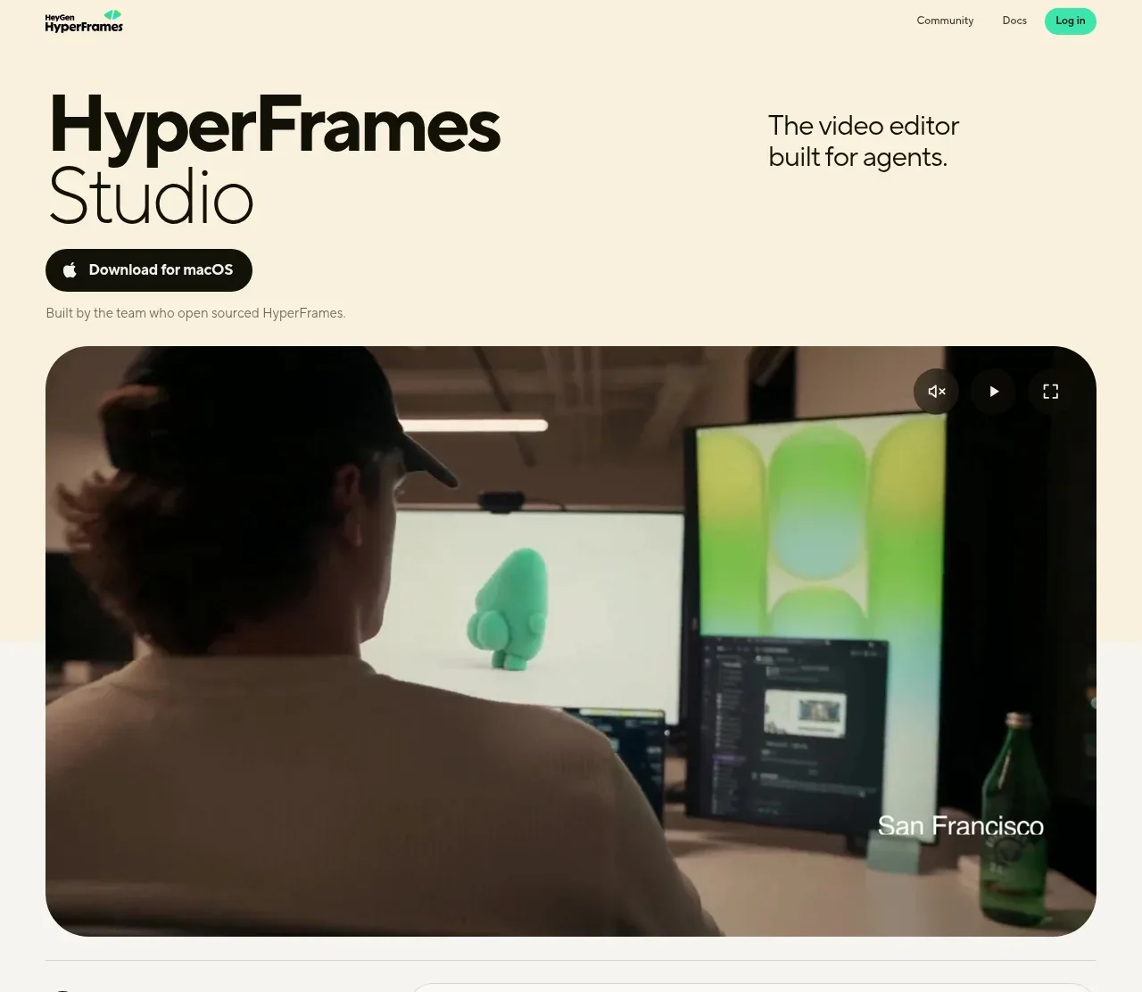
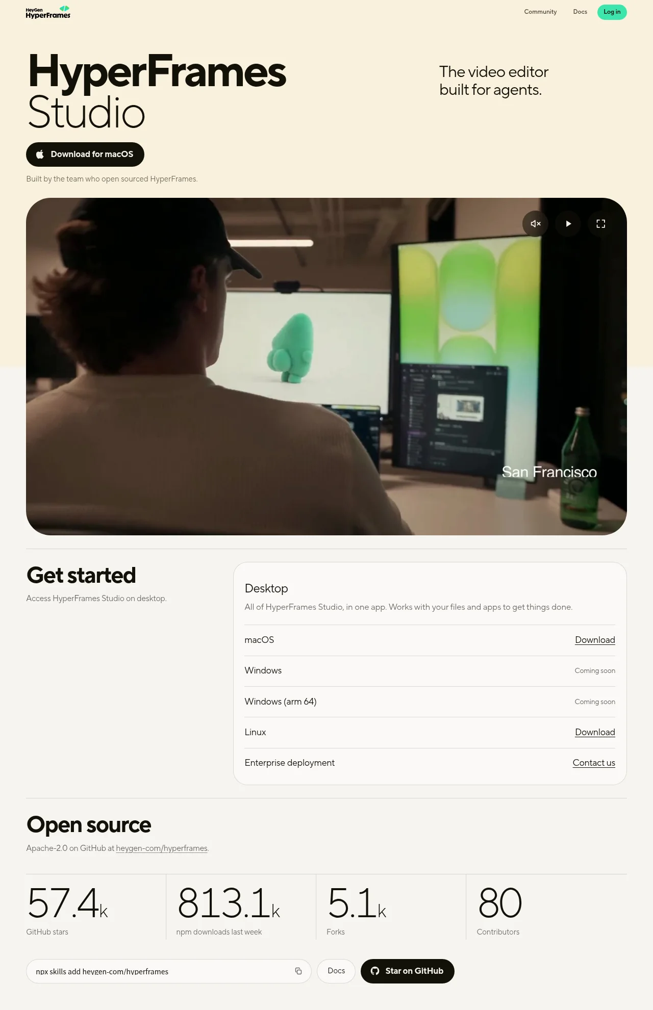
A dark, developer-flavoured landing page for an agent-native video editor. The centred hero pairs a tight-tracked two-line display headline and dual CTAs with a full editor-window screenshot (inspector, canvas, timeline) floating on a violet glow, then the rhythm tightens down the page: a quiet monochrome compatibility strip, an asymmetric code/terminal walkthrough of the prompt-to-render workflow, a bento grid of feature cards each carrying a miniature UI vignette, a dense export-pipeline panel, and a spacious final CTA before a four-column footer. Near-black canvas, hairline 8%-white borders and a single violet accent keep the dense product UI legible, with monospace pills and terminal blocks doing the agent-tooling framing.
Prompt preview
## Reference images

Study these alongside the description below: hierarchy, rhythm, spacing, colour. Build for the product you are asked about, using this design language.

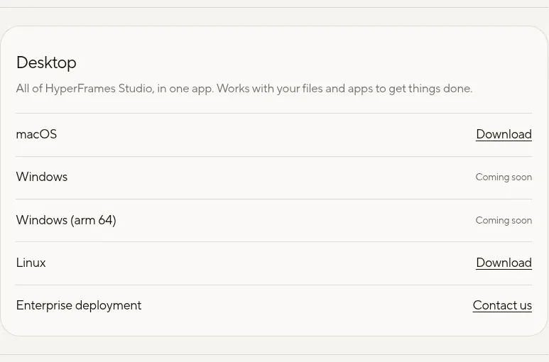
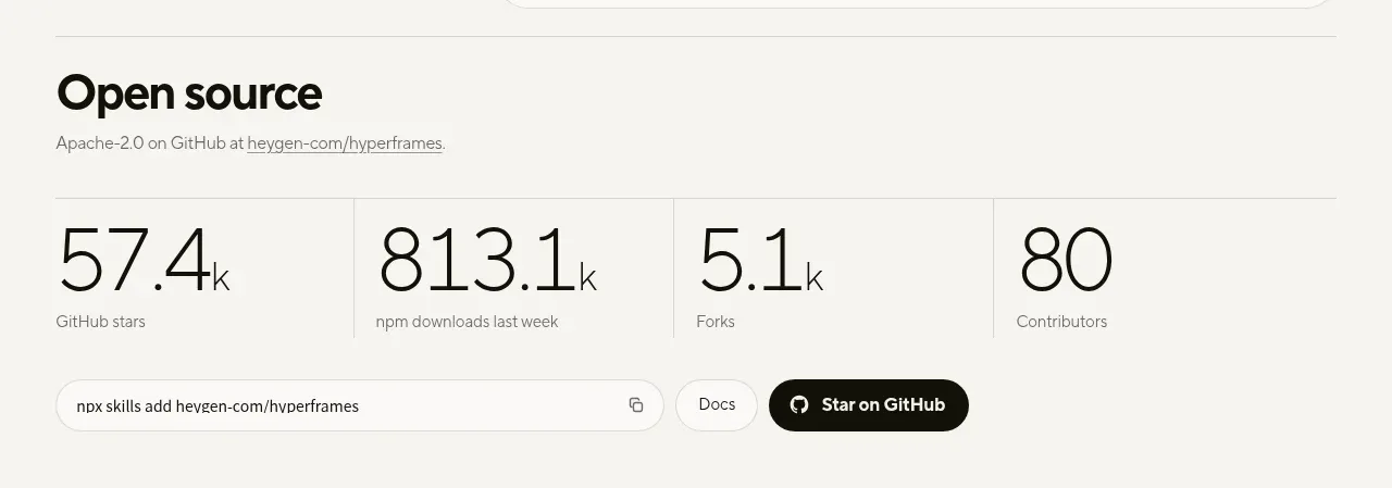
- Full page: https://kage-design-assets.t3.tigrisfiles.io/screenshots/hyperframes-studio-desktop/1316fe77-e26f-4d52-97ca-5ed88a5ce9c1-1791266531375-full.webp
- Above the fold: https://kage-design-assets.t3.tigrisfiles.io/screenshots/hyperframes-studio-desktop/1316fe77-e26f-4d52-97ca-5ed88a5ce9c1-1791266527059.webp
- Design on Kage: https://kage.design/designs/hyperframes-studio-desktop-landing-page

## Before you start
Ask the user what they are building, who it is for, and what brand assets they already have (name, logo, colours, typeface). Wait for the answers before writing any code. Everything below is applied to *their* product — the reference is only a source of layout and visual language.

## Page structure
Top to bottom:

1. **Sticky top nav** — dark translucent bar: wordmark left, 3–4 centre text links (docs, changelog, community), right side a ghost GitHub/secondary action and one filled primary button (e.g. Download).
2. **Hero** — centred stack: a small monospace eyebrow pill (beta/announcement style), a two-line display headline, a 1–2 sentence muted subcopy, two CTAs (filled primary + ghost secondary), and a small muted platform/compatibility note underneath.
3. **Hero product shot** — a full desktop-app window (title bar with traffic lights, left inspector panel, central preview canvas, bottom timeline with clips and playhead) floating on a soft radial violet glow, scaled slightly large so it bleeds toward the next section.
4. **Compatibility strip** — a single quiet row: short "works with your agent" microcopy plus 4–6 evenly spaced monochrome wordmarks, no cards or borders.
5. **Agent workflow section** — asymmetric split: left column with a section heading and 2–3 numbered steps (describe → plan → render); right column a dark code/terminal panel showing a plausible prompt/config and the resulting render log.
6. **Bento feature grid** — 5–6 cards on a 6-column grid with varied spans (one large hero card, the rest smaller): each card has a short label, a one-line description, and a miniature UI vignette (timeline chips, render progress bar, export dialog, inspector fields).
7. **Pipeline / output section** — full-width dark panel: copy about export formats, resolution and speed on one side, a terminal block with render commands and progress readout on the other.
8. **Final CTA** — centred panel restating the promise in one short line with a primary CTA and a ghost secondary.
9. **Footer** — four link columns (product, resources, company, legal) over a bottom row with copyright and social icons, all small muted text.

## Design language
- **Canvas**: near-black background (#0a0a0d); a single radial violet glow is reserved for the hero product shot, everything else stays flat so panels read clearly.
- **Accent discipline**: one violet accent (#8b5cf6, tint #a78bfa) used only for primary CTAs, links, glow and syntax highlights; all remaining UI is grayscale.
- **Type**: one geometric sans (Inter-class) for all copy — display headline 64–72px with −2% tracking, body 16–17px in #a1a1aa; a monospace face (JetBrains-class) at 12–13px for eyebrow pills, labels, code and terminal text, with letter-spaced uppercase eyebrows.
- **Borders & surfaces**: 1px hairline borders at ~8% white; cards 12–16px radius with a barely-visible top-light gradient (white 3% fading out); no drop shadows except a soft ambient shadow under the hero window.
- **Buttons**: primary = filled violet, white text; secondary = transparent with hairline border; both ~40px tall, 16px horizontal padding, 8px radius.
- **Density rhythm**: airy centred hero, then a tight one-row strip, then medium-density card grids and dense code panels, then a spacious final CTA — alternate centred statements with asymmetric splits so no two consecutive sections share a layout.
- **Code panels**: darker-than-page surface (#0d0d11), 12px radius, filename or tab header, syntax colouring limited to the violet, one grey and one soft green; optional line numbers.
- **Interaction**: restrained — nav links brighten on hover, card borders lift to ~15% white, primary button brightens slightly; a slow marquee or gentle glow pulse is acceptable, nothing bouncy.
- **Screenshots**: show the real product as app chrome (window frame, panels, timeline) rather than abstract illustration, cropping edges into section boundaries for continuity; on narrow screens splits stack, bento cards go single-column and the hero shot becomes a rounded card.

## Never
- Do not reuse the reference's product name, wordmark, tagline, copy, screenshots, illustrations or icon set; build everything around the user's product.
- Do not present the result as HyperFrames or imply any endorsement.
- Do not copy third-party agent-tool logos or wordmarks; use the user's real integrations or neutral placeholders.
- Do not stack multiple glows, gradients or neon colours — the page's power comes from restraint.