 kage
kage

Design analysis
A light, grid-disciplined cloud-infrastructure landing page that persuades with real product UI rather than decoration. The hero pairs an oversized grotesque headline with a mock deployment panel (service cards, sparklines, a '$ git push' mono chip) over faint grid lines. Below the hero the rhythm alternates between airy white sections and tinted full-bleed bands: a quiet monochrome logo wall, a numbered three-step flow illustrated with UI fragments, a saturated purple stack band, then a lavender bento grid where cards alternate text-plus-mockup layouts and switch chart colour from violet to green. It closes with sparse icon-led capability and security grids, a playful floating-tile CTA, and a dense black footer with a pixel motif. One violet accent, black rectangular CTAs, hairline borders, and mono type for terminal labels hold the whole page together.
Prompt preview
## Reference images

Study these alongside the description below: hierarchy, rhythm, spacing, colour. Build for the product you are asked about, using this design language.

- Full page: https://kage-design-assets.t3.tigrisfiles.io/screenshots/render-com/a2f1bfec-cff8-46a3-938e-5c68bed6eccd-1789073879-full.webp
- Above the fold: https://kage-design-assets.t3.tigrisfiles.io/screenshots/render-com/a2f1bfec-cff8-46a3-938e-5c68bed6eccd-1789073676647.webp
- Design on Kage: https://kage.design/designs/render-landing-page

## Before you start
Before writing any code, ask the user:
- What product are we building this page for, and what does it do?
- Who is the primary audience?
- What brand assets exist — name, logo, primary/accent colours, typeface?
Wait for the answers. Every rule below is applied to *their* product's name, copy and palette, never to the reference product's.

## Page structure
Build a single scrolling marketing homepage in this exact order:
1. **Announcement bar** — full-width strip with a deep-purple-to-warm-orange gradient, one small centred sentence and an inline pill button.
2. **Header** — logo left, five primary nav links beside it, right-aligned utility links plus one solid-black CTA button; thin bottom border, sticky feel.
3. **Hero** — two columns. Left (~55%): giant headline with a rotating final word, one-sentence subhead, solid-black primary button and outlined secondary button. Right: a product mockup panel — a labelled status card ("PRODUCTION"), 2–3 service rows each with a name, green "Available" status and tiny sparkline charts, a floating monospace `$ git push` chip, and a small theme-toggle button. Faint hairline grid lines across the background.
4. **Logo wall** — centred uppercase eyebrow ("Trusted by over N builders") and two rows of five monochrome customer wordmarks.
5. **Three-step flow** — large short heading ("Click, click, done." energy), then three equal columns, each: violet numbered square, sub-headline, two-line paragraph, and a simplified UI mockup underneath (a select list, a config form, a deploy log terminal).
6. **Stack band** — full-bleed light-purple gradient section: headline on the left with a black button, and a 2×8 grid of rounded purple tiles holding white tech logos on the right.
7. **Bento feature grid** — pale lavender background, big heading with two words tinted in gradient colour. Two-column bento with hairline card borders; alternate wide and paired cards: (a) hosting overview whose headline colour-codes each product noun, (b) pull-request previews with a PR mockup, (c) full-width autoscaling card with a violet area chart, (d) workflows card with a dark code block, (e) Postgres card with a green metrics panel, (f) full-width logs/monitoring card. Each card: heading, one short paragraph, violet "docs →" link, mockup.
8. **Testimonial** — a row of five customer wordmarks, a large pull quote, then name and title in small violet uppercase.
9. **Capability grid** — heading plus one-line intro, then a 4×2 grid: small violet line icon, title, one-sentence description; one cell carries a tiny "COMING SOON" chip.
10. **Security section** — heading with a one-line sub-sentence, 3×2 grid of gradient/pixel-style square icons with title + description, then a black "Trust center" button and an outlined companion button.
11. **Closing CTA** — pastel tech-logo tiles scattered and floating around a centred bordered card containing a heading, a short subline and one black button.
12. **Footer** — near-black, six link columns plus a socials column, a purple pixel/glitch pattern motif in the lower corner, bottom bar with social links and copyright.

## Design language
- **Palette**: white `#FFFFFF` page background; near-black ink `#111112` for headings and buttons; body gray `#52525B`; one violet accent `#7C3AED` (links, numerals, icons, charts); lavender section tint `#F3EFFF`; green `#22C55E` reserved for health/status/database signals; footer black `#0C0C0C`. Announcement gradient from deep purple `#3B1E6E` to burnt orange `#8A4B2A`. Accent colour is scarce — never decorate body text with it.
- **Type**: one grotesque sans throughout, paired with a monospace for terminal text, code, chips and tiny uppercase labels. Hero at clamp(64px–96px) with tight tracking (−0.03em); section headings 40–56px; card headings 24–28px; body 16–18px/1.6; eyebrows 11–12px uppercase with 0.12em letter-spacing.
- **Hierarchy**: let product mockups persuade; keep every paragraph to 1–3 lines. In feature headings, colour-code key nouns so each maps to its section's accent.
- **Buttons**: solid near-black rectangles, white label, 4–6px radius, generous 12px×20px padding, optional trailing "›" chevron; secondary is 1px outline on white. Hover darkens slightly; no gradients on buttons.
- **Borders and depth**: hairline `#E4E4E7` borders and 8–12px radii define cards and mockups; shadows are nearly absent — depth comes from layered mockup elements and background shifts, not drop shadows.
- **Rhythm down the page**: alternate airy white sections with full-bleed tinted bands (purple stack band, lavender bento) instead of divider lines; density peaks in the bento grid, then deliberately drops in the sparse icon grids; end loud-dark with the footer.
- **Mockup language**: build simplified product UI in code — tiny uppercase panel labels, green status dots with the word "Available", monospace values, sparklines in accent colour, log rows with timestamps. Keep them abstract; no real data.
- **Icons**: small 1.5px-stroke line icons in violet for capabilities; square gradient/pixel-style icons for the security grid.
- **Motion**: minimal and calm — a rotating hero word, gentle hover states, no parallax; everything reads as static until hover.
- **Responsive**: hero stacks with the mockup below; bento collapses to one column; icon grids drop to 2 then 1 columns; footer columns stack.

## Never
- Do not use Render's name, logo, wordmark, copy, testimonial text, or its customer logos (OpenAI, Shopify, Bluesky, BlackRock, Base44, etc.) anywhere.
- Do not reproduce Render's exact illustrations, icon set, pixel-art motifs or framework-logo tiles; substitute the user's own stack and brand assets.
- Never present the finished page as Render or imply any affiliation with it.
Components from this page
All components
 Promotional banner with split navigation bar
render.com · Navigation
Promotional banner with split navigation bar
render.com · Navigation
 Technical SaaS hero with infrastructure grid
render.com · Hero
Technical SaaS hero with infrastructure grid
render.com · Hero
 Monochrome customer logo cloud
render.com · Logo cloud
Monochrome customer logo cloud
render.com · Logo cloud
 Three-step feature grid
render.com · Feature grid
Three-step feature grid
render.com · Feature grid
 Stack-flexible technology banner
render.com · Banner
Stack-flexible technology banner
render.com · Banner
 Editorial feature grid
render.com · Feature grid
Editorial feature grid
render.com · Feature grid
 Branded testimonial showcase
render.com · Testimonials
Branded testimonial showcase
render.com · Testimonials
 Builder-focused feature grid
render.com · Feature grid
Builder-focused feature grid
render.com · Feature grid
 Security feature grid
render.com · Feature grid
Security feature grid
render.com · Feature grid
 Security assurance feature grid CTA
render.com · Call to action
Security assurance feature grid CTA
render.com · Call to action
 Grid-backed multi-column footer
render.com · Footer
Grid-backed multi-column footer
render.com · Footer
Related designs
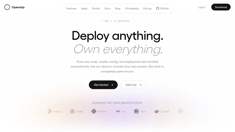

 OpenShip Cloud
Landing page · Cloud & infrastructure
OpenShip Cloud
Landing page · Cloud & infrastructure
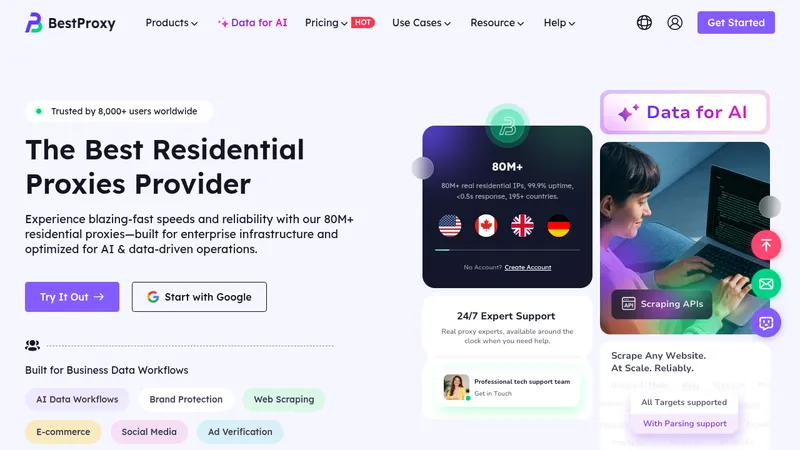

 bestproxy.com
Landing page · Cloud & infrastructure
bestproxy.com
Landing page · Cloud & infrastructure
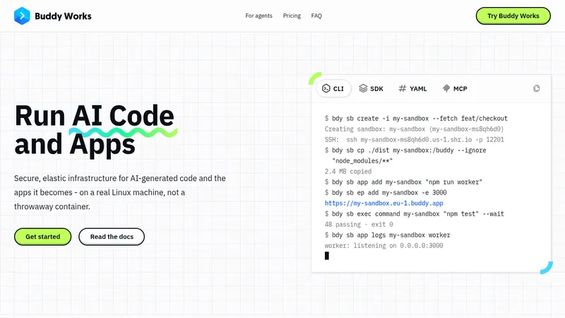

 AI Sandboxes by Buddy
Landing page · Cloud & infrastructure
AI Sandboxes by Buddy
Landing page · Cloud & infrastructure
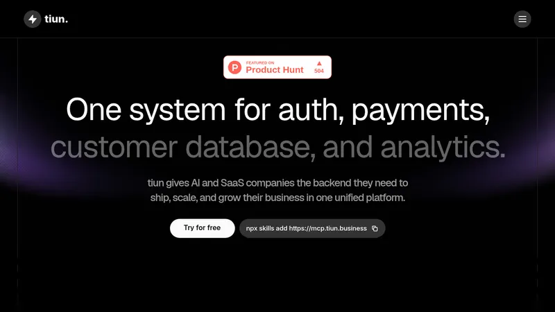

 tiun.
Landing page · Cloud & infrastructure
tiun.
Landing page · Cloud & infrastructure
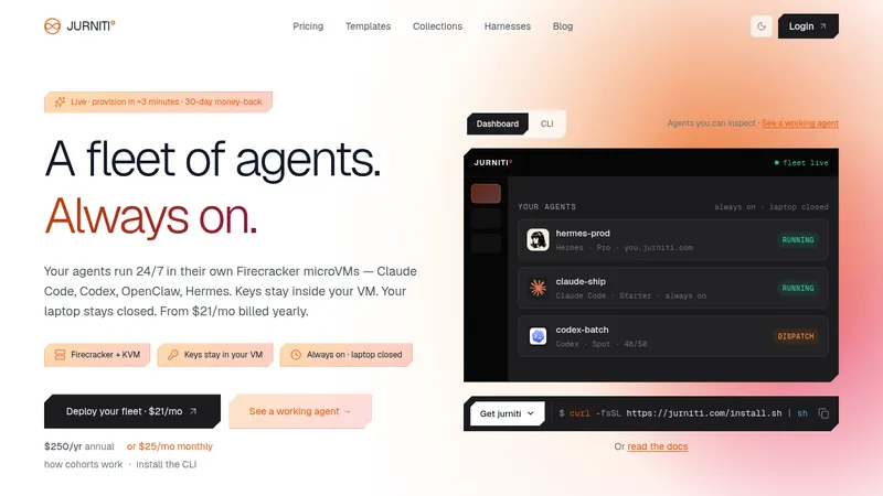

 jurniti
Landing page · Cloud & infrastructure
jurniti
Landing page · Cloud & infrastructure


 cloudflare.com
Landing page · Cloud & infrastructure
cloudflare.com
Landing page · Cloud & infrastructure