kage
dotsapp.cloudaeri.com

Design analysis
An Apple-adjacent, strictly monochrome landing page where all colour weight is handed to the dark, glassy product mockups. The type system is editorial: oversized two-line headlines that end in a period, letter-spaced uppercase eyebrows, and generous whitespace, with hairline rules separating each alternating feature row. Rhythm resets twice mid-page — a centered notch-configurator ("What do you keep checking?") and a mascot-personalization pair of cards break the text-left/visual-right cadence — before pricing cards, a cashback promo, an FAQ accordion and a giant halftone-dotted wordmark close the page.
Prompt preview
## Reference images

Study these alongside the description below: hierarchy, rhythm, spacing, colour. Build for the product you are asked about, using this design language.

- Full page: https://kage-design-assets.t3.tigrisfiles.io/screenshots/dots/b0dd4f13-dbbe-4e80-ab36-79d3ad587c26-1792821726796-full.webp
- Above the fold: https://kage-design-assets.t3.tigrisfiles.io/screenshots/dots/b0dd4f13-dbbe-4e80-ab36-79d3ad587c26-1792821721311.webp
- Design on Kage: https://kage.design/designs/dots-landing-page

# Dots-style monochrome product landing page

## Before you start
Ask the user what they are building, who it is for, and what brand assets they already have (product name, colours, typeface, mascot or icon). Wait for the answers before writing any code. Everything below is applied to *their* product, not to the reference.

## Page structure
1. **Top nav** — wordmark left; 4–5 quiet text links (product areas, "Developers", "Free & Pro", "Before you download"); one small utility pill and one high-contrast dark pill CTA ("Get [Product] ↗") right.
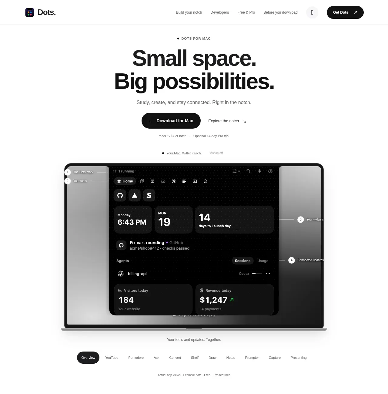
2. **Hero** — centered eyebrow ("• [PRODUCT] FOR [PLATFORM]"), a giant two-line headline where each line ends in a period, a one-line subhead, then two CTAs: solid dark pill ("Download for [OS]") plus a quiet "Explore ↗" text link. Fine print underneath: OS requirement · trial terms.
3. **Hero mockup** — a large laptop-frame visual filled with the product's actual dark UI (widget grid, clock, activity rows, stat cards), annotated with numbered callout dots (1–4) on thin connector lines labelling zones. A caption line beneath ("Your tools and updates. Together.") and a small "Motion off" toggle hint.
4. **Feature switcher** — a row of pill tabs (Overview, then one per feature) with the active one as a dark pill; a disclaimer microline below ("Actual app views · Example data").
5. **Five alternating feature rows**, each separated by a full-width 1px hairline: left column has an eyebrow ("FEATURE · INCLUDED IN FREE" or "· PRO"), a two/three-line headline with sentence periods, short paragraphs or bullet lines, and an "Explore ↗" link; right column holds the visual — a dark window mockup, a MacBook mockup, or a light capture-panel card — each with its own state pills ("Drop a file / Choose a format", "Focus / Paused / Ready for a break") and a small gray caption grounding it in reality.
6. **Centered configurator break** — eyebrow "YOUR [SPACE]. YOUR DAY.", centered headline ("What do you keep checking?"), one-line sub. Two columns: left a selectable grid of tool cards (icon, name, one-line description; grouped into "essentials" and "explore the possibilities") with a count ("2 essentials selected") and a "Reset" link; right a laptop mockup showing the combined UI, captioned.
7. **Personalization section** — centered eyebrow "A LITTLE PERSONALITY" + headline ("Make it yours.") with a free/pro split note. Two cards: a greeting-preview card with an optional name input and "Say hello ↗" button, and a picker card with tabs and a grid of character tiles labelled with names and plan badges (Free/Pro).
8. **Developer bridge band** — eyebrow "FOR THE PEOPLE WHO BUILD", two-line headline ("Your workflow. Within reach."), one-line sub, "For developers ↗" button right-aligned.
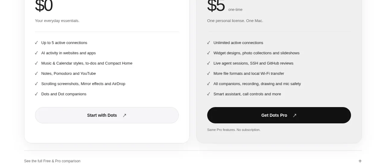
9. **Pricing** — eyebrow "A SIMPLE PLACE TO START", two-line headline, right-aligned trial note. Two cards: Free ($0, checklist, quiet pill CTA) and Pro ($5 one-time, longer checklist, 1-device/3-device toggle, dark pill CTA). An expandable "See the full comparison" row beneath.
10. **Referral promo** — eyebrow "SHARE YOUR MOMENT", headline, two side-by-side offers (50% cashback at 2,000 views; 100% at 10,000) plus a "How to claim" link.
11. **FAQ** — left column headline ("Before you download.") with three short answer teasers; right an accordion of ~10 questions with hairline dividers, first item expanded showing a real paragraph answer.
12. **Final CTA** — centered app icon, two-line headline ("Less switching. More doing." pattern), one dark pill download button, fine print.
13. **Footer** — logo + description + version line left; three link columns (Explore / Product / Good to know); a giant halftone-dotted wordmark of the product filling the bottom edge with a circular arrow button; bottom microbar with tagline, version + copyright, "Powered by" note.

## Design language
- **Palette**: the page stays near-white (#FFFFFF–#FAFAFA) with ink near-black (#111113) and mid-gray secondary text (#6E6E73); hairlines at #E8E8E8. All visual weight sits inside product mockups: near-black glass surfaces (#0A0A0A–#1C1C1E) with soft gray gradients, white text, and at most one tiny accent (a red annotation arrow, a green tick).
- **Type**: one grotesque family throughout. Headlines clamp ~56–88px, tight tracking (-0.02em), deliberately broken into two lines each ending in a period. Eyebrows are 11px uppercase with 0.12em letterspacing in gray. Body 14–15px at 1.6 line height; captions 12px gray under every visual.
- **Hierarchy**: eyebrow → headline → proof (mockup) → caption. Every claim is paired with a caption that grounds it ("Actual app views · Example data"), which builds trust without colour.
- **Rhythm and density**: airy throughout — 96–140px vertical padding, roughly 55/45 text/visual split in feature rows. Full-width 1px hairlines divide the rows; break the alternation twice with centered, symmetrical sections to reset attention before pricing.
- **Borders, radius, shadow**: flat white cards with 1px light borders and 12–24px radii; pills fully rounded; shadows soft and low so dark mockups appear to float on the white page.
- **Components**: pill tabs with a dark active pill; paired state pills that read as a mini-narrative; numbered callout dots on connector lines for UI tours; thin-glyph checklist rows; accordion with hairline dividers and generous row height.
- **Motion**: restrained — state labels ("Motion off"), gentle hover darkening on pills; no parallax or colour flashes.
- **Mascots**: if the user's brand has characters, show them as flat tiles on light gray with a name and plan label; keep everything else monochrome so they are the only playfulness on the page.

## Never
- Do not reuse the Dots wordmark, logo, octopus companions, or any copy from the page ("Small space. Big possibilities.", "Less switching. More doing.", "Drop it. Convert it. Carry on.", etc.).
- Do not reuse the notch/MacBook framing unless the user's product genuinely targets that hardware context.
- Do not introduce accent colours, photography, stock illustrations or icon sets the reference does not use; never present the result as Dots.
Components from this page
All components
 Minimal product navigation
Dots · Navigation
 Product promise with desktop preview
Dots · Hero
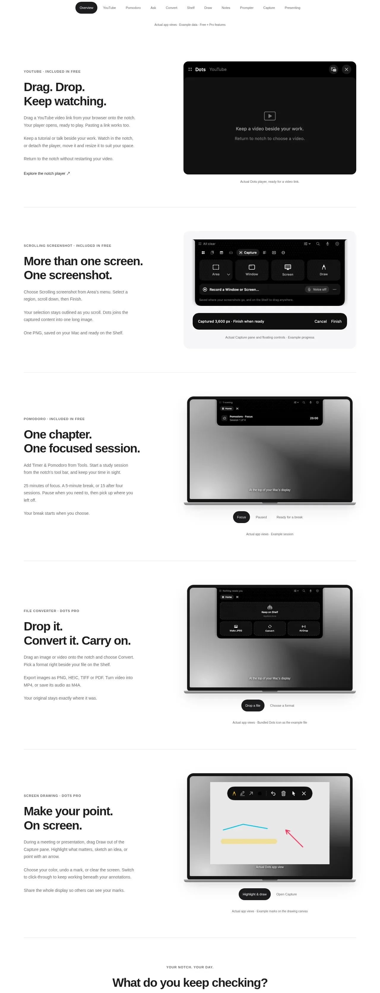 Product capability showcase
Dots · Feature grid
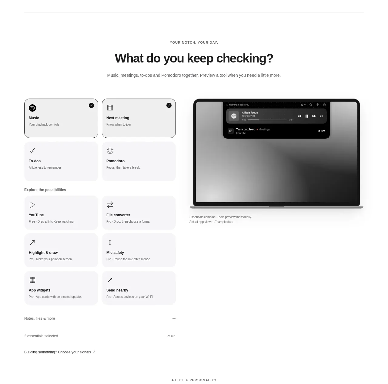 Selectable essentials builder
Dots · Feature grid
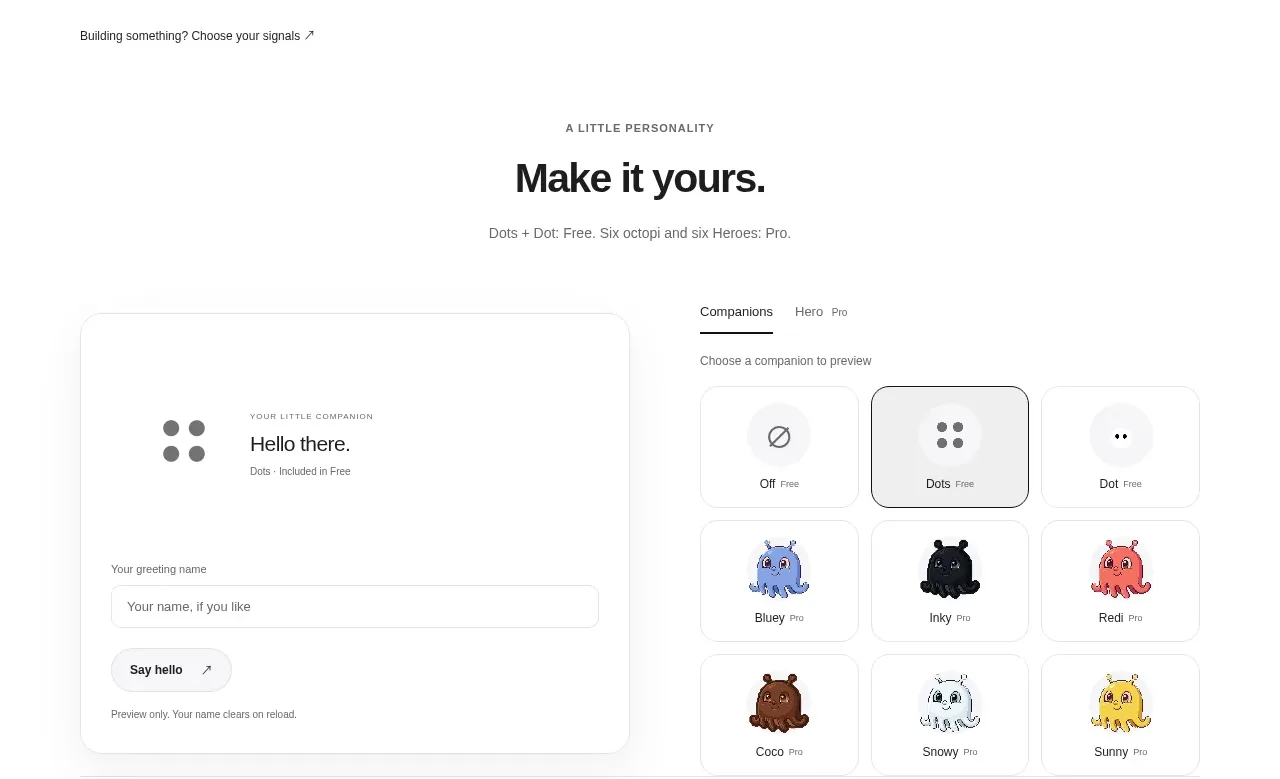 Developer workflow callout
Dots · Call to action
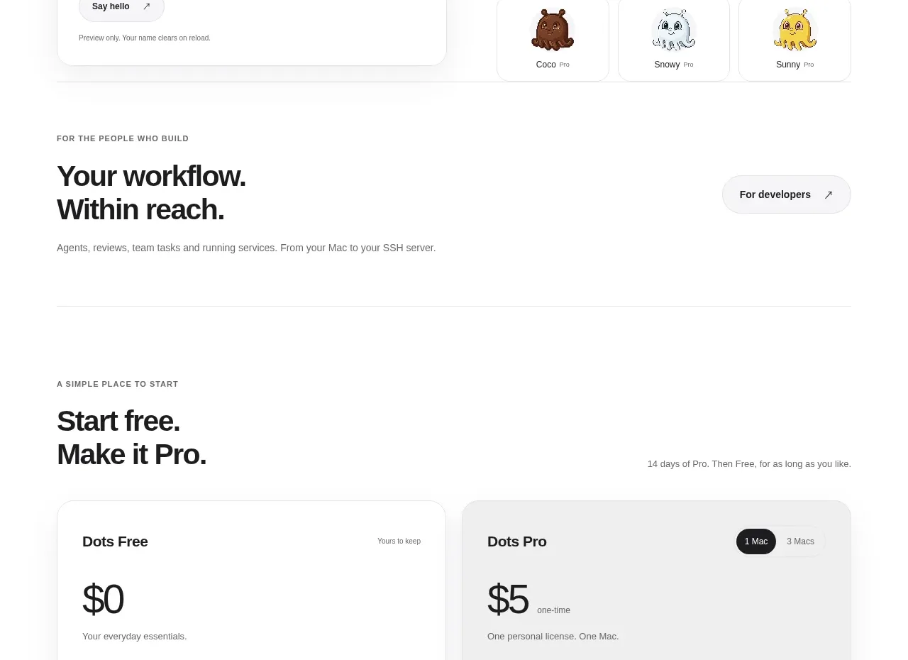 Free and pro pricing cards
Dots · Pricing table
 Promotion outcome stats
Dots · Stats
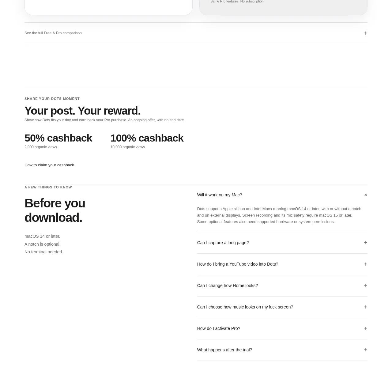 Pre-download FAQ
Dots · FAQ
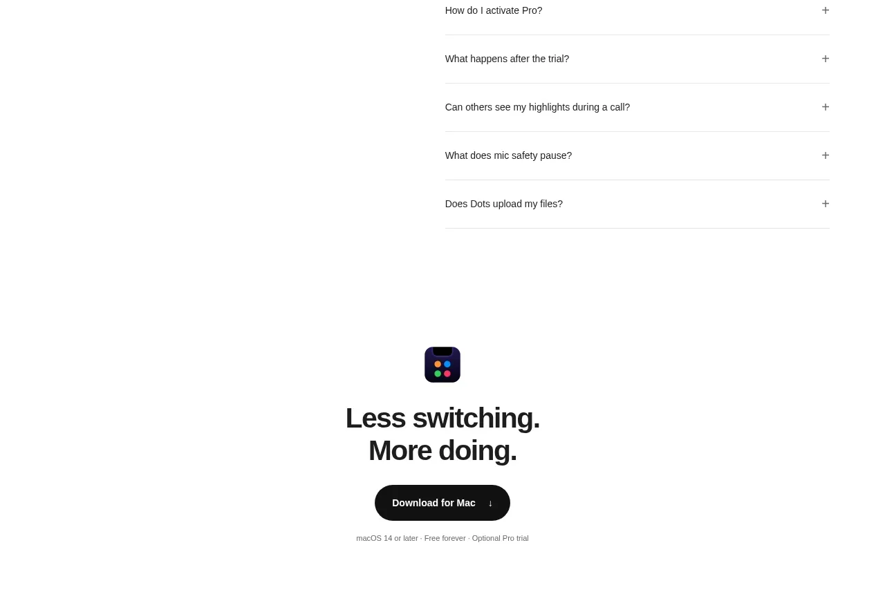 Final download CTA
Dots · Call to action
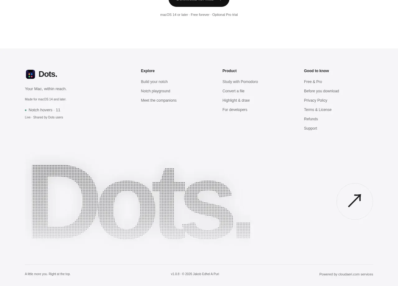 Multi-column site footer
Dots · Footer